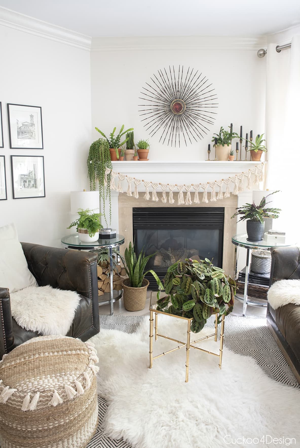
Why Do Pots Often Clash with Home Decor?
Many homeowners and interior decorators struggle with integrating plant pots seamlessly into their interior design. The reasons for this mismatch often stem from overlooked details related to color, material, size, and style. Understanding these factors can help you avoid jarring contrasts and instead create a cohesive look that enhances both your plants and your living space.
1. Ignoring Color Harmony
One of the most common reasons pots clash with the decor is the choice of colors that don’t complement the existing palette of the room. For example, a bright red pot in a room dominated by soft neutrals will stand out in an unintended way. Conversely, pots that blend too much with the background may cause plants to lose visual focus.
2. Using Incompatible Materials
The material of your pots plays a vital role in how well they fit into your home’s aesthetic. Glossy ceramic pots might look out of place in rustic, farmhouse-style interiors, while rough concrete pots may feel too cold for cozy, traditional rooms.
3. Overlooking Scale and Proportion
Large bulky pots in a small room or tiny pots in an expansive space can disrupt the visual balance. Properly sized pots maintain harmony and prevent the plants or pots themselves from dominating or disappearing in the decor.
4. Mismatched Styles
Just as furniture style matters, pots also carry design languages — modern, vintage, bohemian, industrial, etc. A sleek modern pot will feel out of place in a Victorian-inspired room unless carefully integrated.
Choosing Pot Colors That Complement Your Home
To achieve a harmonious look, selecting pot colors that either blend or tastefully contrast with your room’s palette is key.
Use the Color Wheel
- Analogous colors: Choose pot colors adjacent to your room’s dominant color on the color wheel for a subtle, cohesive look.
- Complementary colors: Use colors opposite on the wheel to create lively contrast without clashing.
- Neutral colors: White, black, gray, and beige pots are versatile and suit most interiors.
Consider Texture and Finish
Matte finishes often soften colors, while glossy finishes intensify them. A matte pot in a similar color to your wall can blend well, while a glossy pot in a complementary color adds a pop of excitement.
Selecting Pot Materials to Enhance Your Room
The material of your pots can amplify the style and mood of your space. Here’s how to choose:
Ceramic
Great for traditional, modern, and eclectic spaces. Glazed ceramics offer vibrant colors and finishes, while unglazed terracotta provides earthy warmth.
Metal
Ideal for industrial or contemporary decor. Copper and brass add warmth, while brushed steel or aluminum add sleekness.
Wood
Natural wooden pots or planters work well in rustic, bohemian, and Scandinavian interiors, adding texture and organic feel.
Concrete and Stone
These materials suit minimalist, modern, and industrial styles, providing a solid, grounded look.
Plastic
While affordable and lightweight, plastic pots can vary widely in style and finish. High-quality plastic pots can mimic other materials and are suitable for casual or contemporary spaces.
Matching Pot Styles with Different Decor Themes
Choosing pots in line with your interior style ensures seamless integration.
Modern and Minimalist
- Sleek, geometric shapes
- Monochrome or muted colors
- Materials: Ceramic, metal, concrete
Bohemian and Eclectic
- Bright colors and patterns
- Natural textures like woven baskets and wooden pots
- Handcrafted or artisanal finishes
Traditional and Classic
- Elegant shapes like urns or pedestal pots
- Materials: glazed ceramics in soft colors
- Ornate detailing and textures
Industrial
- Raw, rugged materials: metal, concrete
- Simple, functional shapes
- Neutral or dark tones
FAQs
Q: Can I repaint or customize pots to better match my decor?
A: Yes, repainting pots with suitable paint for the material is a cost-effective way to customize colors and patterns to fit your style.
Q: How do I balance pot size and plant size?
A: Your pot should be slightly larger than the plant’s root ball to allow growth without overwhelming the plant or space.
Q: Are matching pot and furniture colors recommended?
A: Not necessarily. While matching can create uniformity, contrasting pots can make plants stand out as focal points.
Q: How often should I update my pots to keep up with decor trends?
A: Pots can last many years. Focus on timeless styles and colors for longevity, updating only if your decor undergoes a major change.
Key Takeaways
- Color, material, size, and style are critical when selecting pots to match your home decor.
- Use color theory to pick pot colors that complement or contrast your room effectively.
- Choose pot materials that enhance your interior’s mood and style.
- Match pot styles with your decor theme for seamless integration.
- Customizing pots is an easy way to adapt existing ones to your space.
References
- House Beautiful: Best Planters for Home Decor
- Architectural Digest: The Best Indoor Plant Pots
- Real Simple: How to Choose Planters for Indoor Plants
